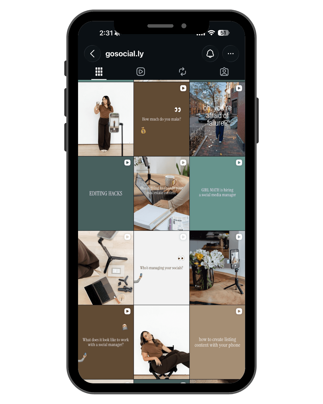
Start with a palette and a point of view
Pick a tight color palette — three to five shades — and actually stick to it. Every graphic, cover, and edit should live in that world. Add a consistent voice: the way you write captions is as much a part of your feed as the images.
Cohesion is repetition. When someone lands on your profile, the palette and voice should feel unmistakably you within one scroll.
Use content pillars
Decide on three to five recurring themes — your 'pillars' — and rotate through them. For a local brand that might be: education, behind-the-scenes, social proof, and offers. Pillars keep your feed varied without feeling random.
This is also what makes a feed sustainable. When you always know your next post fits one of four buckets, the guessing (and the stress) disappears.
Design the grid, not just the post
Think about how posts sit next to each other, not just how each looks alone. Alternating post types — a graphic, then a photo, then a Reel cover — creates rhythm. Consistent cover styles for Reels make the whole profile look designed rather than dumped.
Plan a few posts ahead so you can see the grid come together instead of reacting post-by-post.
Fonts, templates, and the details that read as 'premium'
Two fonts, used consistently, will do more for your brand than ten trendy ones. Build a small set of reusable templates for covers and quotes so every post starts on-brand instead of from a blank canvas.
The little things — consistent margins, aligned text, the same accent color — are what separate a feed that looks expensive from one that looks homemade.
Do a 60-second feed audit
Open your profile and squint. Does it read as one brand? Are the colors consistent? Can a stranger tell what you do in five seconds? If not, you've found your first fixes.
Then set up a simple system — palette, pillars, templates — so staying cohesive takes minutes, not agony.
Key takeaways
- Lock a tight 3–5 color palette and two fonts, then repeat them everywhere.
- Rotate 3–5 content pillars so your feed is varied but never random.
- Design the grid, not just individual posts — consistent Reel covers matter.
- Reusable templates make staying on-brand fast instead of exhausting.
The Go Social.ly perspective
A cohesive feed makes a small brand look established — and an established brand look premium. Go Social.ly builds complete feed systems for Katy and Houston brands so every post reinforces the level of your business. Inquire and we'll show you what yours could look like.
Need a content system built around your business, not a generic template?